
Red Against the Ruins: An Editorial Portrait Session at Dumbarton Shoreline
The color came first.
Before we talked about timing or locations or what the light would do, the look was already decided — deep red, fitted, with long opera gloves in the same saturated tone. A statement built for contrast. And the question I had from the first conversation was immediate: where do you put a look like that?
Not a garden. Not a meadow. Not anywhere that was already trying to be beautiful.
You put it somewhere that has no interest in being beautiful at all.
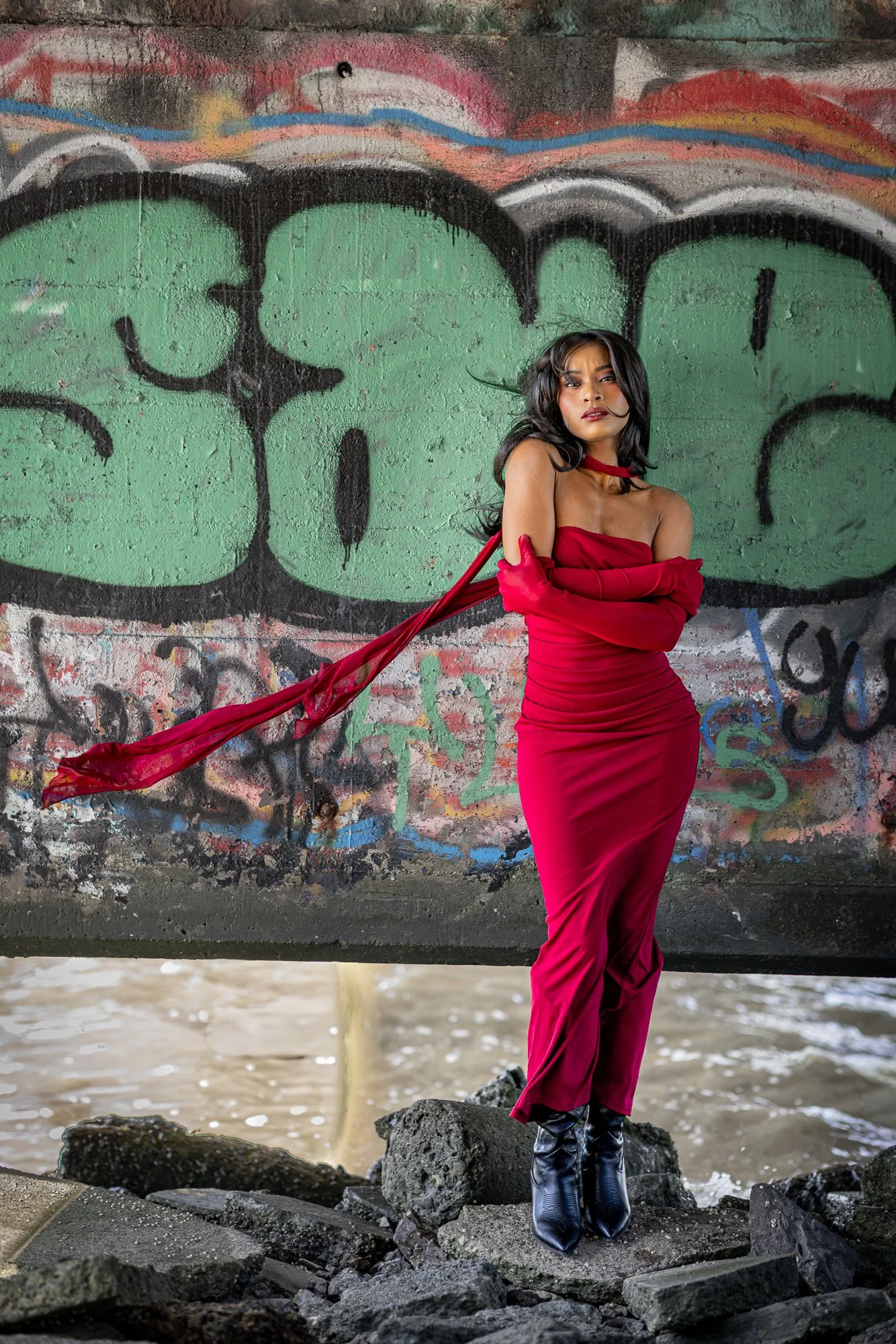
The color came first — deep red against a wall that doesn't ask permission to be loud.
The Dumbarton Shoreline Trail in Newark doesn't make it onto many photographers' location lists. It's not manicured. There's no permit desk at the entrance, no carefully maintained grounds, no seasonal blooms to time your visit around. What it has instead is texture — layer after layer of it. Rusted pipeline infrastructure. Concrete that's been tagged with spray paint for decades. Driftwood piled along the waterline. An old pump house slowly returning to its component materials.
It's a location that filters for a specific kind of shoot. Not every subject, not every look. But when the match is right, there's nothing else in the Bay Area that comes close.
This was the match.
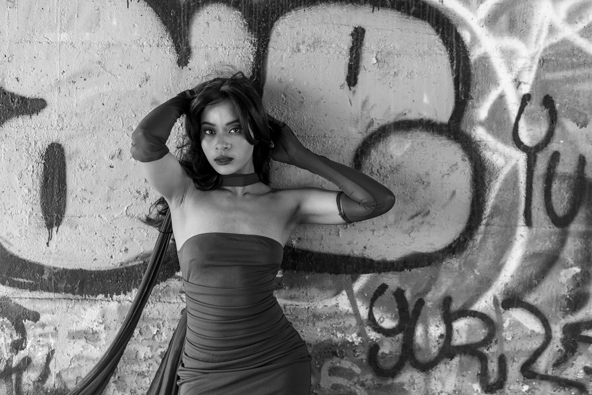
Black and white was the only version of this frame that worked — the graffiti becomes tone instead of competition.
The first backdrop we worked was the graffiti wall — a section of concrete abutment covered floor-to-ceiling in layered tags. Green, orange, red, black, white, stacked and competing in every direction. As a background it grabs attention immediately. It also creates a specific editing problem I knew I'd face before I ever raised the camera.
The red dress.
Put a saturated red subject against a saturated multicolor background and you have a fight — every color in that wall is pulling the eye away from where it should be. So I shot the wall both ways: straight color, and with the understanding that at least some frames were going to black and white in post. In black and white, the graffiti resolves into tone and texture instead of competing hues. The subject becomes the only thing with presence. The wall becomes structure.
That specific frame — leaning back against the concrete, hands up near her head, looking directly into the lens — only works in black and white. In color it's busy. In black and white it's a portrait.
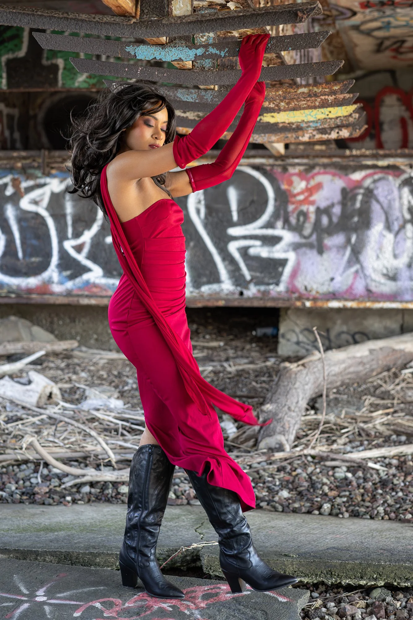
The rusted grating had been waiting for exactly this use.
Past the main graffiti stretch, deeper into the location, there's a section where old infrastructure has partially collapsed. Rusted steel — grating, pipe fittings, I-beams — sits at just above head height against the walls behind it. It's the kind of structural debris most location scouts walk past. I'd clocked it on a previous visit and thought: that's a prop waiting to happen.
There's a specific quality to oxidized metal in photographs. The warm brown tones read almost like wood in certain light, and the surface texture is extraordinary up close. I positioned low and framed up so the grating filled the upper portion of the frame, then asked for an arm extended into it — reaching rather than posed.
The wind had been steady all morning. Strong enough to lift fabric and move hair, but consistent enough that it wasn't random. You learn to work with it rather than wait for it to stop.
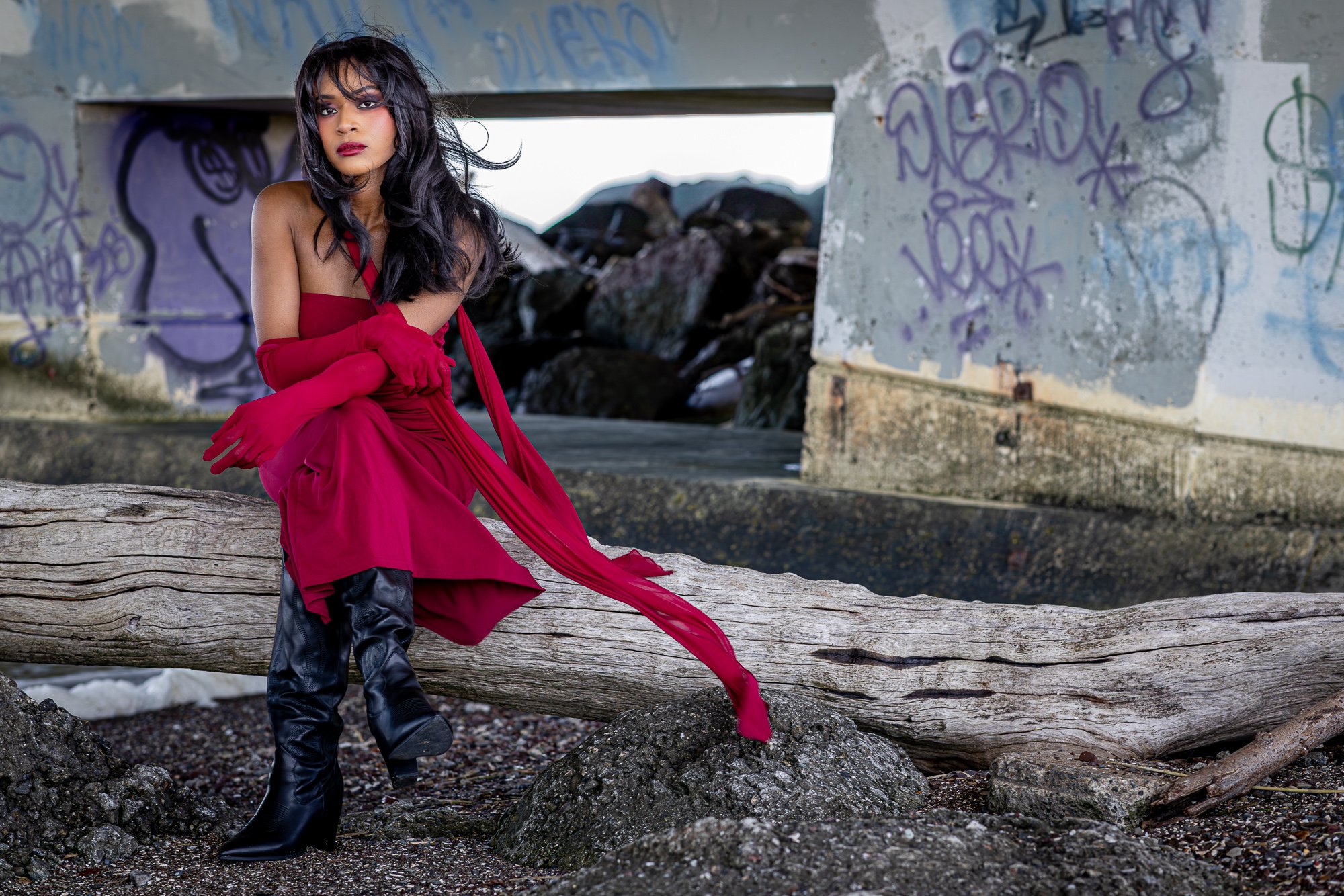
The driftwood log and the bridge frame behind it — a composition the location handed me.
There's a section of the shoreline where an enormous driftwood log sits stranded against the base of the bridge structure — bleached pale grey by sun and saltwater, completely immovable. The bridge abutments behind it create a natural frame: two concrete walls with an opening between them that looks straight through to open sky and more graffiti beyond.
A red dress against grey driftwood is a different visual problem than a red dress against a graffiti wall. The driftwood is almost colorless. It doesn't compete — it recedes. The question is the quality of the light coming through that framing gap, and whether the wind gives the fabric somewhere to go.
Both came through.
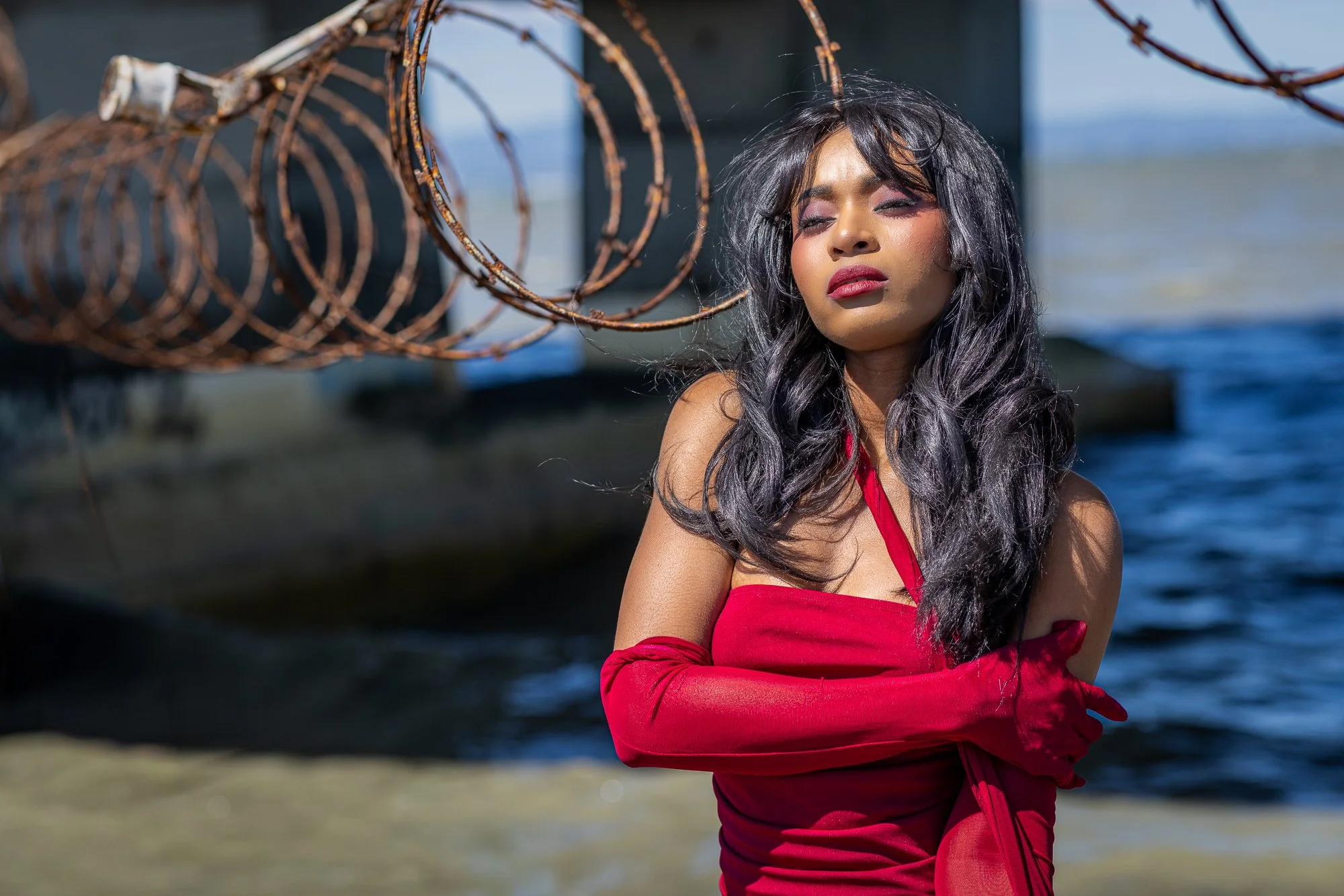
Bay light through razor wire — a backdrop that only exists here.
Near the water's edge, the old infrastructure includes coils of razor wire mounted above the concrete barrier — rusted now, the barbs softened into brown spirals that photograph as almost organic shapes against open sky. This is not a backdrop that exists anywhere a permit desk controls access. It reads as industrial, specific, completely of this place.
The challenge with razor wire in a frame is placement. Too little and it disappears into background noise; too much and it takes over. I positioned below the wire level, angled up so the spirals sat in the upper left of the frame as soft shapes against the blue of the bay. Then I pulled back to a portrait crop — tight enough on the face that the background becomes environment rather than location.
Eyes closed for this one. The wind was in the hair. The light off the water was doing what bay light does on a clear morning.
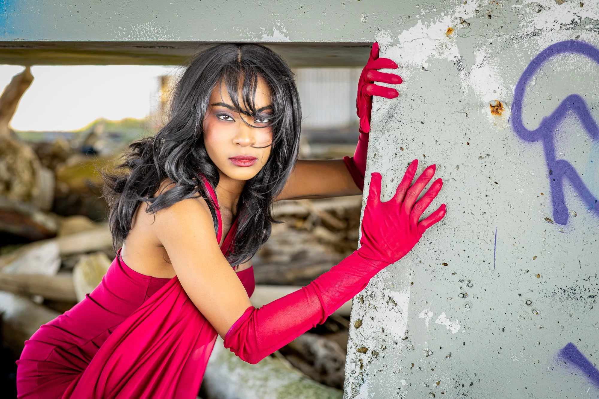
Maximum eye contact. The silver wall strips everything back to just the subject.
The silver wall.
A section of weathered concrete — peeling paint, the surface somewhere between grey and sage, a horizontal metal beam framing the top of the shot. In a session full of texture and competing color, this spot is almost quiet. The surface is neutral. It asks the subject to do more of the work.
What I wanted from this frame was maximum eye contact. Hair across the face from the wind. Both gloved hands on the concrete wall edge. Body angled in rather than squared up to the camera. The gaze straight into the lens.
When it came, it came immediately. Sometimes a location tells you exactly where to put the camera, and the subject just shows up for it.
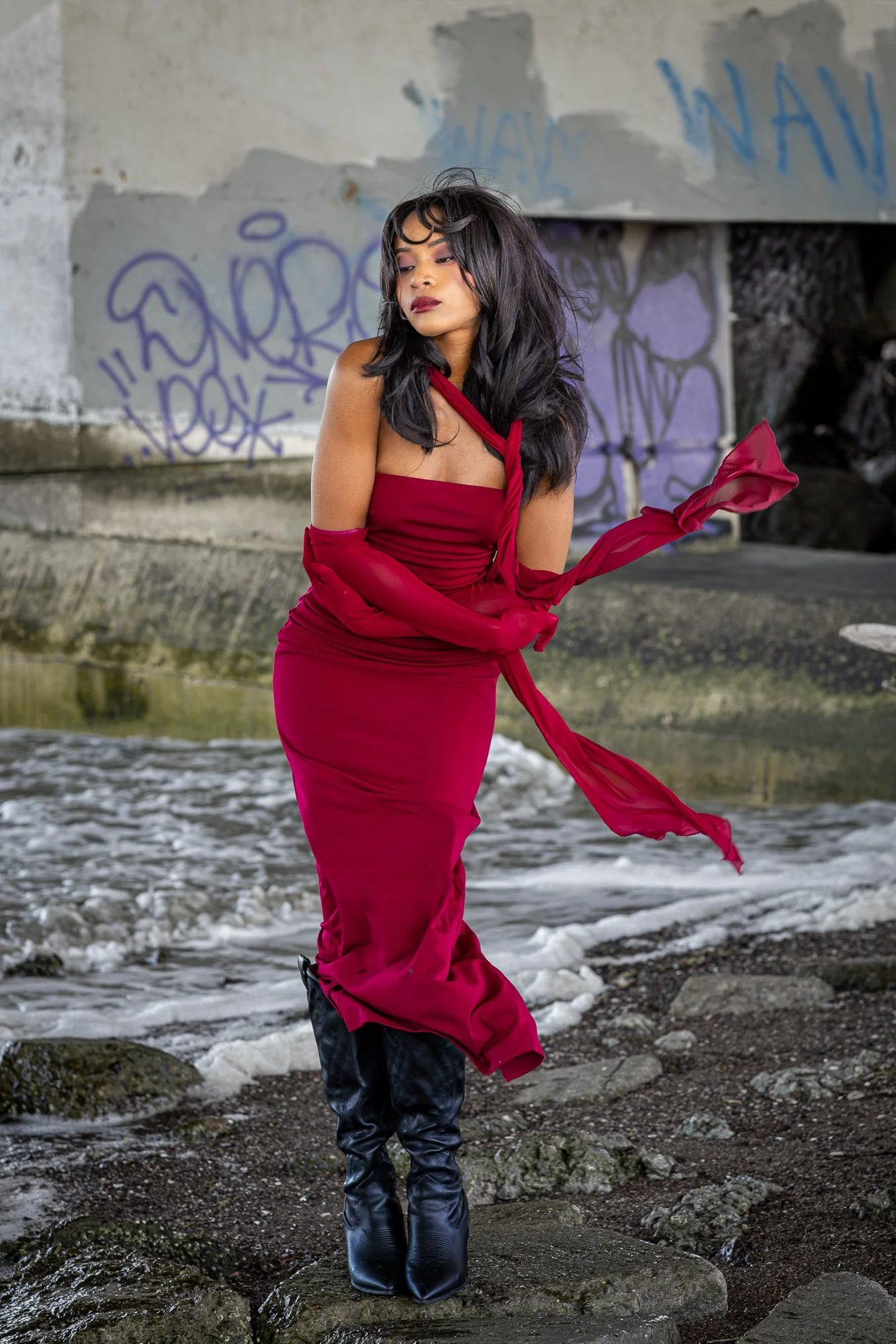
The wind wasn't a problem to manage — it was part of the image.
The last frames came back toward the water — the tideline, concrete wet from spray, graffiti walls catching the noon light. Wind still up.
There's a version of this location that's purely gritty — raw and industrial and deliberately unglamorous. And there's a version where you bring in something so bold and deliberate that it reframes everything around it. The red dress does the latter. It doesn't soften the location. It just gives you a reason to be there that makes total visual sense.
That's the calculation at the heart of a session like this: location and subject in genuine tension, and images that are better for the friction.
About Personal Lifestyle Photography at Dumbarton
The Dumbarton Shoreline Trail is one of the most distinct personal lifestyle photography locations in the Bay Area — and one of the least photographed. If you're drawn to a session with real visual character rather than a manicured backdrop, it belongs at the top of your list. I've documented it alongside thirty other Bay Area locations, broken down by season, light conditions, and session type, in my Bay Area outdoor photography locations guide.
Sessions start at $450 for three hours and 20+ edited images. Get in touch here if you have a vision you want to bring to a location like this.