
Inside the Filoli House: A Black and White Editorial Session
The decision was made before we walked through the door.
A model in a couture pink chiffon gown, an afternoon inside Filoli's historic interior, every frame in black and white. Not as a stylistic afterthought. Not as a salvage decision in editing. As the brief.
The reason matters, and it's the whole point of this post.
Filoli's interior is photographed often and rarely well. The house was built in 1917 by William and Agnes Bourn — Empire Mine gold, Spring Valley Water Company shares — and the interior has been kept close to its original state. Carved staircases, period wallpaper, a working historic kitchen, a mahogany-framed safe by the Hermann Safe Company of San Francisco, oil lamps converted to electric, a side table with stacked old issues of Sunset Magazine. Every surface signals 1920s.
That's the problem. Shot in colour, those signals dominate. The frame becomes about the wallpaper, the fixtures, the period authenticity of the kitchen tile. The subject becomes a costumed figure inside a heritage interior. Even with a contemporary couture gown, the frame reads as period drama — Downton Abbey with a model dropped in.
Black and white removes the period reading. The wallpaper becomes pattern. The brass becomes value. The oil lamp on the side table becomes a shape. The dress, freed from competing with a hundred years of decorative colour, becomes sculpture.
This is what the session was built to demonstrate.
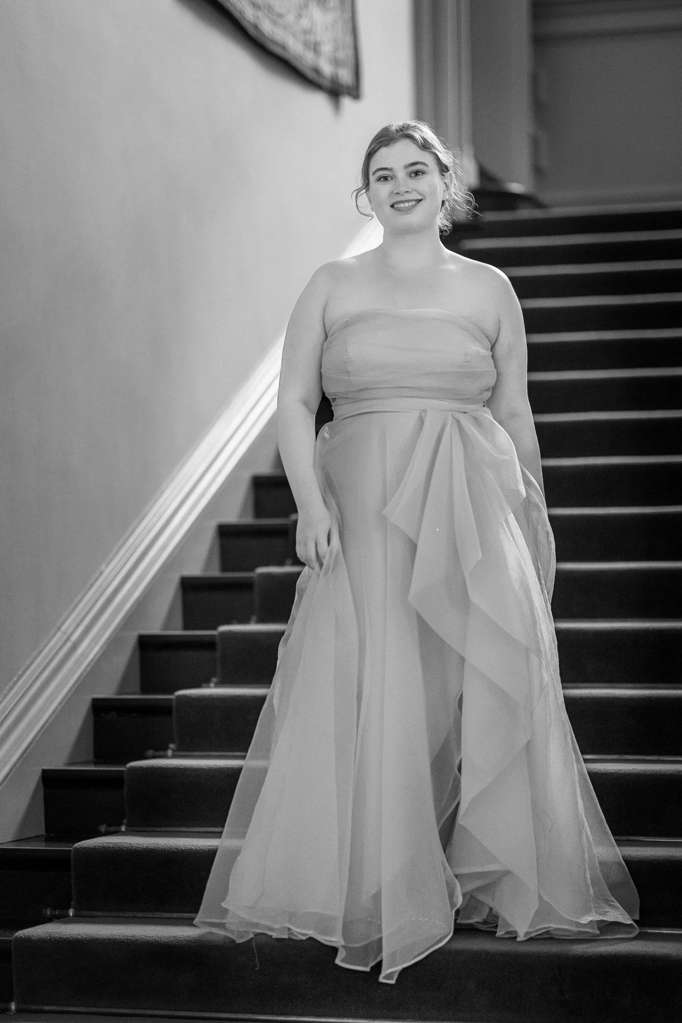
The staircase — exposure metered for the dress, shadows allowed to fall where they wanted.
We started on the staircase.
Filoli's main staircase is wide, dark-wooden, with a heavy carved banister and a runner that absorbs light. In colour, it's a brown frame with a brown subject — the dress's pink dies in the shadows of the wood. In monochrome, the staircase becomes a structure of values. The banister anchors the right side. The treads create rhythm. The dress reads as the brightest thing in the frame, descending.
I shot this on the 35–70 at 50mm, ISO 1600, f/2.8 — Filoli's interior is darker than it looks, and even at midday the staircase needed real exposure compromise. I metered for the dress and let the shadows go where they wanted. The result is a frame that reads less like a portrait of someone on stairs and more like a Vogue editorial from the 1950s — when fashion photographers regularly worked in deep monochrome and let architecture do the heavy lifting.
That reference matters. Black and white is not a default — it's a deliberate signalling device. It says editorial, not snapshot. It says fashion, not event. For this session, that's exactly the language we wanted.
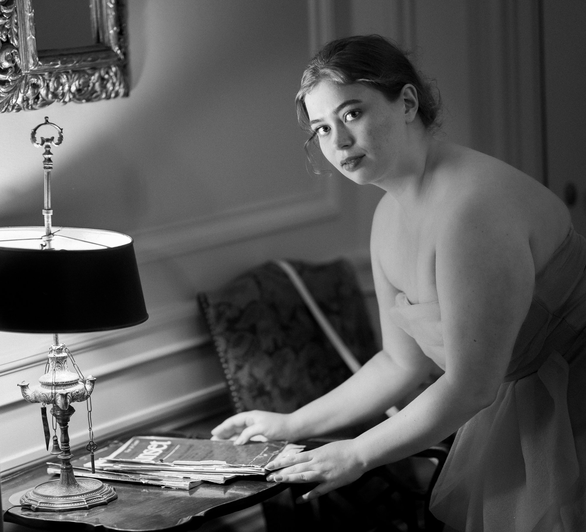
The side table — the frame that demonstrates what black and white actually does to a scene like this.
The side table moment was unplanned.
We were walking between rooms when I saw it — a small carved table against the wall, a brass-and-fabric oil lamp on it, a gilded mirror above, and a stack of vintage Sunset Magazine issues piled to one side. The light from the window across the room was falling across the table in a soft diagonal. The model paused near it. I asked her to lean in, hand on the magazines, and look toward the camera.
It's the most editorially interesting frame of the day.
In colour, the magazines would scream their date — yellowed paper, mid-century typography, period orange tones in the cover art. The frame would become about the magazines. In black and white, they become a stack of forms with type. The eye reads them as texture, not as artefact. The model's gaze becomes the subject. Everything else falls into supporting role.
This is the frame that demonstrates what black and white actually does to a scene like this. It removes the noun status from the historical objects and gives them adjective status. They describe the model. They don't compete with her.
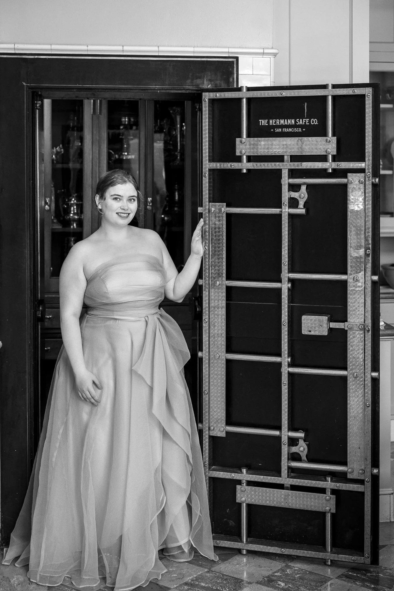
The Hermann Safe — 1917 American industrial heritage, contemporary couture, monochrome collapsing the gap.
The safe is the standout frame of the day.
Filoli's silver vault is built into a small room off the dining wing — a black steel safe door, hinges as thick as a man's wrist, "THE HERMANN SAFE CO. — SAN FRANCISCO" stencilled in white across the front, hand-hammered metalwork on the back. It was made for the Bourns to store the family silver. It's still there. It still works.
I positioned the model just inside the open door, hand resting on the steel, the safe door angled into the frame to provide both texture and a strong vertical line on the right. The dress chiffon catches the light from the room behind her. The safe is matte black. The contrast is everything.
What this frame does — what black and white lets it do — is collapse the gap between 1917 and now. The dress is contemporary couture. The safe is a hundred-and-eight-year-old piece of American industrial heritage. In colour, those two things would read as costume against artefact. In monochrome, they read as the same image. Both become studies in form.
Cinematographers have been using black and white for exactly this reason for a hundred years. Take The Lighthouse, Ida, Roma — modern films shot in monochrome to remove time period as a variable and let the frame work as pure composition. The same logic applies here.
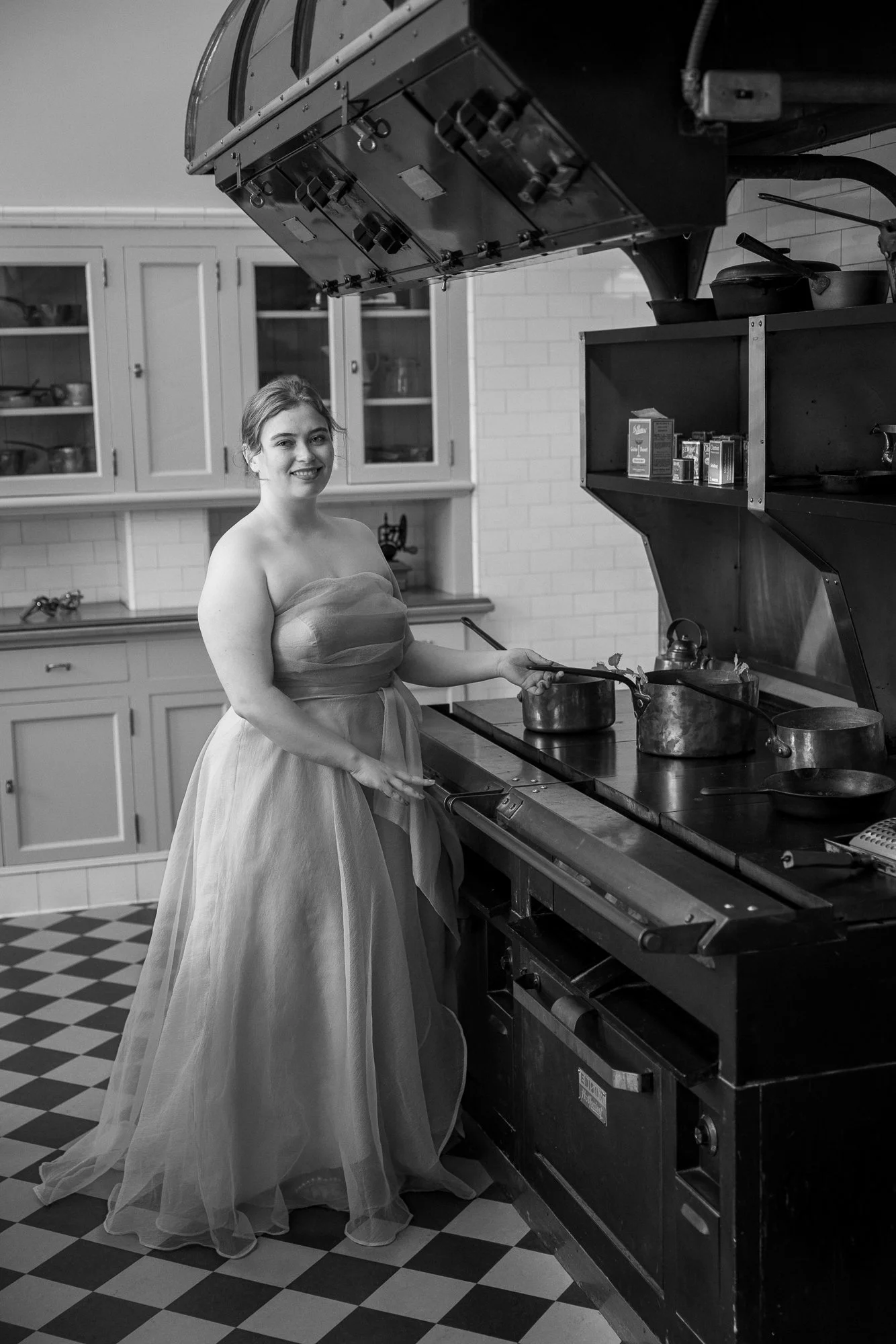
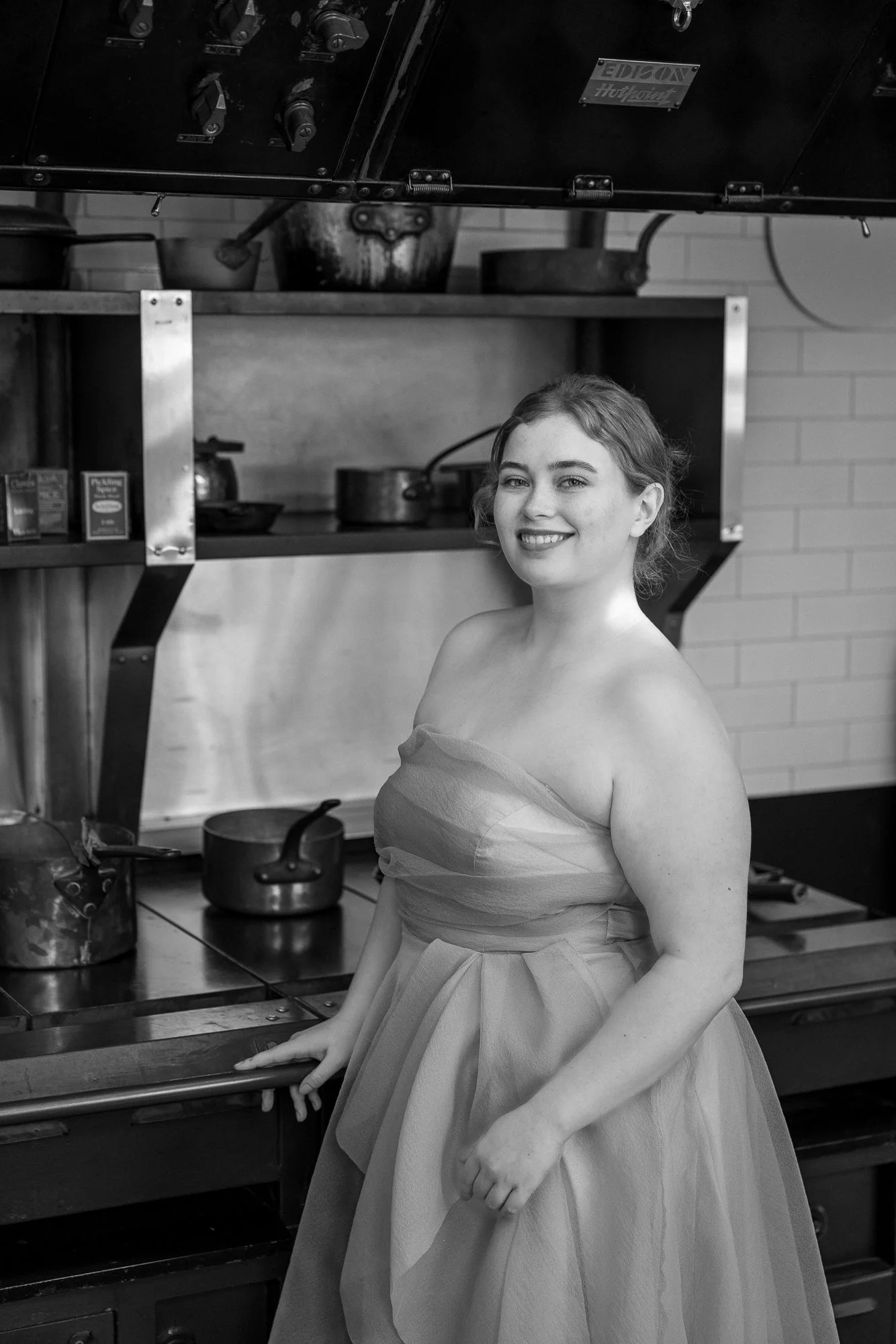
The kitchen — graphic interior, contemporary form within it.
The kitchen is the most beautiful working space in the house.
White subway tile, black-and-white checked floor, an enormous Edison Hotpoint stove from the 1920s, copper pots in the warming rack, a proper period larder behind. Every surface is a graphic element. In colour, the kitchen reads as living-history museum — and the model in a pink gown reads as anachronistic. In monochrome, the kitchen reads as a graphic interior, and the dress reads as a perfectly placed contemporary form within it.
I shot this on the 35–70 at 35mm, standing at the doorway, exposing for the dress and letting the stove fall into deep value. The checked floor draws the eye toward the model. The copper pots glow. The vertical lines of the cabinets frame her on both sides.
For a commercial portfolio, this kind of frame does specific work — it shows a model can hold a graphic interior, not just a flattering outdoor light. That's the kind of image that an agent or a commercial brand looks at and thinks this person can be cast for editorial, not just lifestyle.
The closing frame — the model occupying the architecture rather than being absorbed by it.
The closing frame is a portrait, not an environmental shot.
By this point in the session we'd already covered the wider kitchen frame — the architecture of the room. What I wanted last was the model occupying that architecture, treated as the subject. Tighter focal length, eyes at the camera, the stove and copper falling out of focus behind her.
This is the frame that does the most work in a model book. It says: I can shoot in this kind of environment. I can hold the camera. I can be photographed against history without being absorbed by it. All of those statements are useful in a commercial portfolio context.
It's also the simplest frame of the day. The setup took thirty seconds. Everything that made it possible — the lighting decision, the colour decision, the location, the dress, the model's experience — was already in place. The shutter just had to find the moment.
Why Monochrome Inside Filoli
Black and white isn't a fallback. It's not a salvage move. It's not a "looks classy" filter. It's a deliberate decision about what the photograph is of.
Inside Filoli, in colour, the photograph is of the house. In monochrome, the photograph is of the subject inside an architectural environment that doesn't compete for attention. That distinction is the entire point of working monochrome — you give up colour as a variable and gain composition, value, and timelessness in exchange.
For most sessions, I shoot in colour. Bay Area light is good for it, the gardens want it, lifestyle clients want their photographs to feel warm and present. But for a commercial editorial inside a heritage interior with a contemporary couture gown, monochrome was the only honest answer. The photographs would not have been as strong any other way.
This is the second of three posts from this session. The first was the Filoli gardens, shot in colour for a commercial brief — formal architecture, hard midday light, dress and brand together. The third is at Pulgas Water Temple, shot as editorial composition — same model, completely different location, looser brief.
If you want to see what a more naturalistic, lifestyle-led session at Filoli looks like — softer light, less formal direction, candid moments rather than constructed frames — see my spring session at Filoli with Lavina.
You can see more locations like Filoli in my guide to the best Bay Area outdoor photography locations, or get in touch to talk about your own session.
*** Model: Avalon Butler — represented by The Dreamers Management ***